Difference between revisions of "Category:Charts"
From PhotoVoltaic Logger new generation
m |
m |
||
| Line 1: | Line 1: | ||
[[File:ChartDialog.png]] | [[File:ChartDialog.png]] | ||
| − | + | == Axis == | |
By default 5 axis on each side of the chart are available. If you need mode, just take a look into <tt>frontend/View/Index/dialog.chart.tpl</tt> :-) | By default 5 axis on each side of the chart are available. If you need mode, just take a look into <tt>frontend/View/Index/dialog.chart.tpl</tt> :-) | ||
| Line 7: | Line 7: | ||
The axis unit label is detected from the '''1<sup>st</sup> channel''' assign to this axis, so take care to attach channels of the '''same unit''' to the '''same axis'''. | The axis unit label is detected from the '''1<sup>st</sup> channel''' assign to this axis, so take care to attach channels of the '''same unit''' to the '''same axis'''. | ||
| − | + | == Series display type == | |
* Line | * Line | ||
| Line 16: | Line 16: | ||
* Scatter | * Scatter | ||
| − | + | == Dash style == | |
Use these styles for visual alignment of channels. | Use these styles for visual alignment of channels. | ||
| − | + | == Line width == | |
Use these different 3 line width for highlighting channels. | Use these different 3 line width for highlighting channels. | ||
| − | + | == Mark reading values == | |
You can mark several values with a value label. "All" is only useful for bar charts | You can mark several values with a value label. "All" is only useful for bar charts | ||
| − | + | == Presentation == | |
For meter channels you can show the values according to the consolidation period, see [[Bar chart example]] for details. | For meter channels you can show the values according to the consolidation period, see [[Bar chart example]] for details. | ||
| − | + | == Color == | |
Some collors are pre-defined, you can choose from the whole color range. | Some collors are pre-defined, you can choose from the whole color range. | ||
| − | + | == Color for values below threshold == | |
To make e.g. negative values more visible, you can show them in a different color. | To make e.g. negative values more visible, you can show them in a different color. | ||
Please see also the following examples. | Please see also the following examples. | ||
Revision as of 13:11, 6 March 2014
Contents
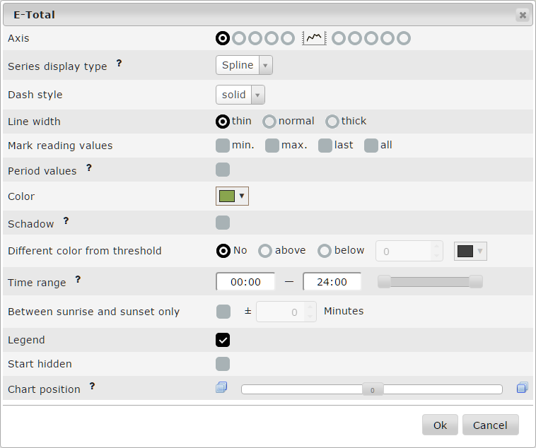
Axis
By default 5 axis on each side of the chart are available. If you need mode, just take a look into frontend/View/Index/dialog.chart.tpl :-)
The axis unit label is detected from the 1st channel assign to this axis, so take care to attach channels of the same unit to the same axis.
Series display type
- Line
- Spline
- Spline with min./max. range
- Spline with area
- Bar
- Scatter
Dash style
Use these styles for visual alignment of channels.
Line width
Use these different 3 line width for highlighting channels.
Mark reading values
You can mark several values with a value label. "All" is only useful for bar charts
Presentation
For meter channels you can show the values according to the consolidation period, see Bar chart example for details.
Color
Some collors are pre-defined, you can choose from the whole color range.
Color for values below threshold
To make e.g. negative values more visible, you can show them in a different color.
Please see also the following examples.
Pages in category "Charts"
The following 9 pages are in this category, out of 9 total.
