Spline chart
From PhotoVoltaic Logger new generation
Here we have use foolwing features:
- Axis
- Negative values
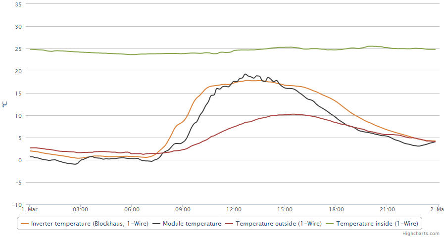
We have here 4 temperature channels. They have all the same unit °C, so it is fine to put them all at same axis.
By default, it would look like this:
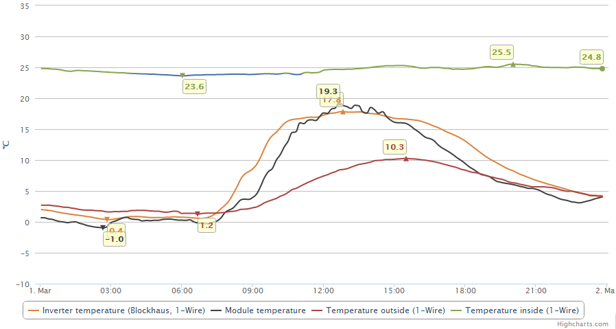
Let's pimp it a bit:
- Show us the min. and max. values
- Show us inside temperatures below 24°C in an other color
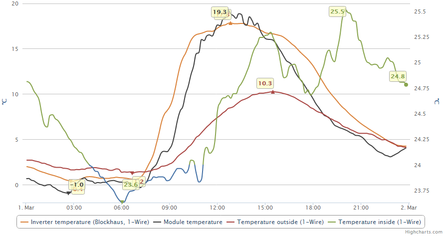
The inside temperature is more or less in an other value range like the others, so let'put it on it's own (right) axis:


