Difference between revisions of "Bar chart example"
From PhotoVoltaic Logger new generation
(Created page with "Demonstrating the following charting features: * Bar chart * Label all values * Show period values File:BarChart.png Bar charts are fine for all channel types, but espec...") |
m |
||
| Line 8: | Line 8: | ||
Bar charts are fine for all channel types, but especially for meter channels to show production/consumption data. | Bar charts are fine for all channel types, but especially for meter channels to show production/consumption data. | ||
| − | Here it is fine to show all labels, for splines it makes no sense because of to many data points. | + | Here it is fine to show all labels (for E-Total channel), for splines it makes no sense because of to many data points. |
If you render meter channels as bars, you should mark "period values", otherwise it looks ugly like that: | If you render meter channels as bars, you should mark "period values", otherwise it looks ugly like that: | ||
Latest revision as of 15:15, 2 March 2014
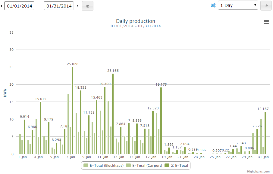
Demonstrating the following charting features:
- Bar chart
- Label all values
- Show period values
Bar charts are fine for all channel types, but especially for meter channels to show production/consumption data.
Here it is fine to show all labels (for E-Total channel), for splines it makes no sense because of to many data points.
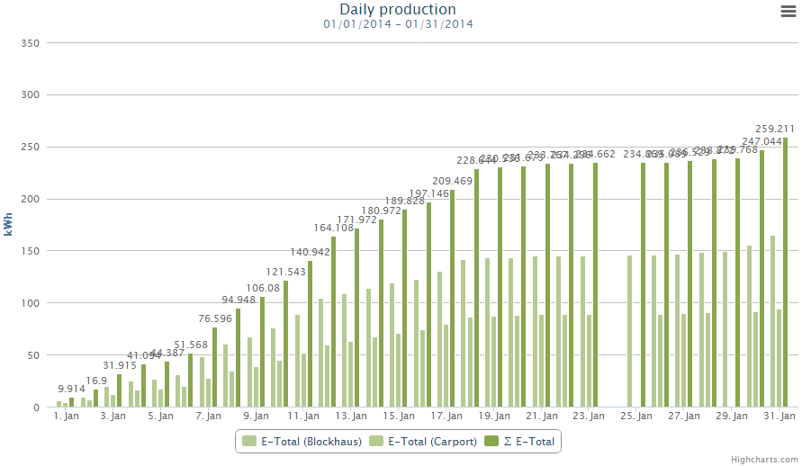
If you render meter channels as bars, you should mark "period values", otherwise it looks ugly like that:

