Difference between revisions of "Spline chart"
From PhotoVoltaic Logger new generation
(Created page with "Here we have use foolwing features: * Axis * Negative values We have here 4 temperature channels. They have all the same unit °C, so it is fine to put them all at same axis....") |
m |
||
| (One intermediate revision by the same user not shown) | |||
| Line 10: | Line 10: | ||
Let's pimp it a bit: | Let's pimp it a bit: | ||
| − | * Show us the min. and max. values | + | * Show us the min. and max. values, for inside temperature also the last one (if you take a look a look at "today", it will be the "actual" value) |
* Show us inside temperatures below 24°C in an other color | * Show us inside temperatures below 24°C in an other color | ||
[[File:TemperatureChart2.png]] | [[File:TemperatureChart2.png]] | ||
| − | The inside temperature is more or less in an other value range like the others, so let'put it on | + | The inside temperature is more or less in an other value range like the others, so let's put it on its own (right) axis: |
[[File:TemperatureChart3.png]] | [[File:TemperatureChart3.png]] | ||
[[Category:Charts]] | [[Category:Charts]] | ||
Latest revision as of 15:45, 2 March 2014
Here we have use foolwing features:
- Axis
- Negative values
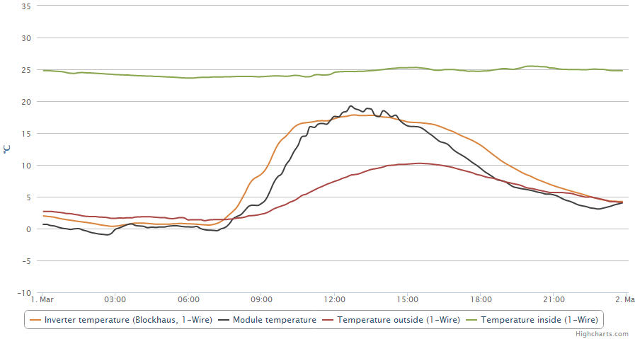
We have here 4 temperature channels. They have all the same unit °C, so it is fine to put them all at same axis.
By default, it would look like this:
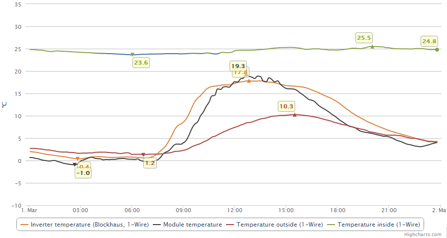
Let's pimp it a bit:
- Show us the min. and max. values, for inside temperature also the last one (if you take a look a look at "today", it will be the "actual" value)
- Show us inside temperatures below 24°C in an other color
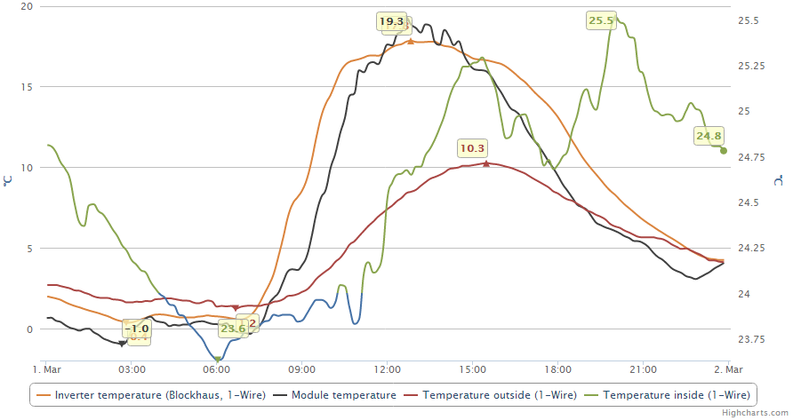
The inside temperature is more or less in an other value range like the others, so let's put it on its own (right) axis:


